You may have seen some of the awesome examples combining Tableau’s background images with custom polygons to generate stadium maps, baseball strike zones, and so forth. While these are relatively easy to do in Tableau, there is a certain process involved, and getting the exact coordinates on the image can be challenging.
I’m going to use common request, a planogram for shelf space, to show you a tool for easily drawing out your polygons, and how then to get it all set up in your Tableau viz.
We’re going to end up with this:
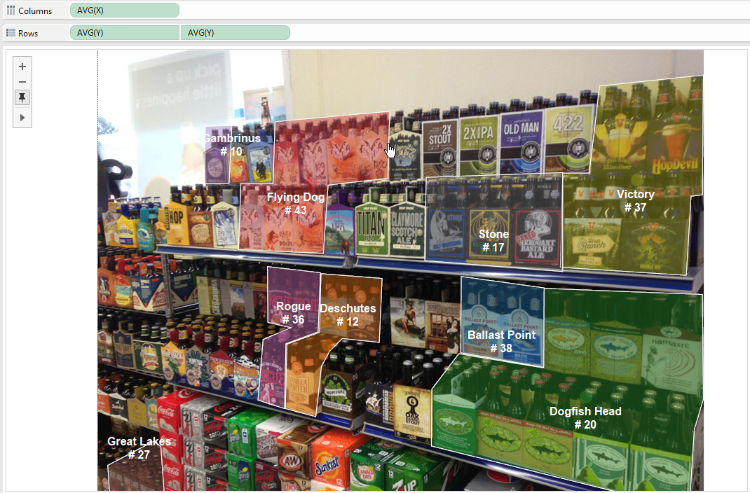
tableau planogram example using background image and custom polygons
(image taken from http://brewprof.com/craft-beer-spot-jeffs-marathon/ who I hope won’t have any objections)
There are three pieces to any background image map in Tableau.
- Data, with an identifier column to match up with the polygons you draw
- An image
- A polygon mapping data source
Let’s talk about how Tableau represents polygons. Every row will represent a vertex (corner) of a polygon. To know which vertex belongs to which polygon, there needs to be an identifier on each row. Then there should be an X coordinate and a Y coordinate column. Finally, each polygon vertex needs an Order, so that Tableau knows how to draw the lines.
This can be in any data source, but since we’re generating them manually using our tool, Excel or CSV will work just fine. The data will look something like this:
Identifier,Path_ID,X,Y
Victory,1,977,499
Victory,2,1243,482
Victory,3,1253,649
Victory,4,1277,652
Victory,5,1279,905
Victory,6,1060,882
Victory,7,1038,698
Victory,8,982,698
Stone,1,982,699
Stone,2,694,689
Stone,3,691,689
Stone,4,691,513
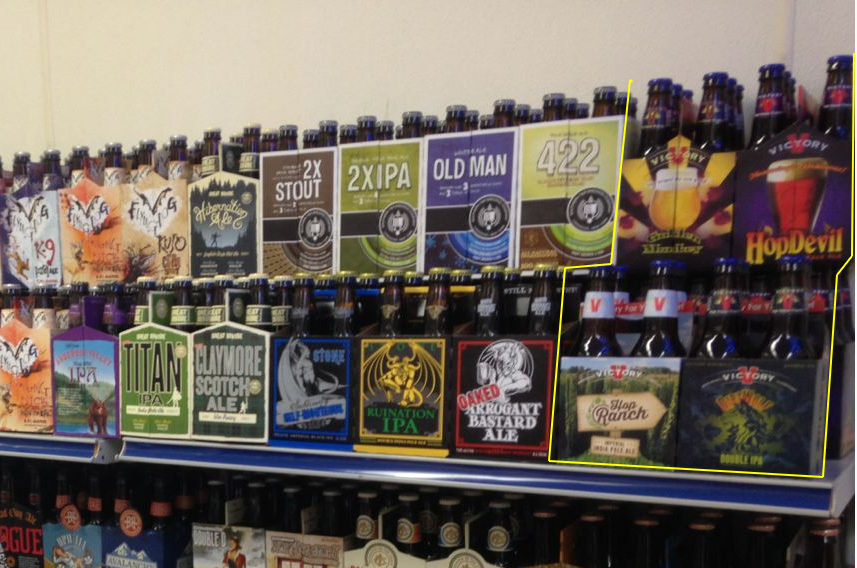
We want our Identifier to match up with something in our data. For this example, I grabbed the Top 50 US Breweries in 2013 from https://www.brewersassociation.org/attachments/0001/4525/CBP13_Top_50.pdf . I copied down the names and ranks into a spreadsheet, attached here: Top Breweries
I’m going to use the Short Company Name to name my polygons as I create them.
The next steps involve my “Draw Tableau Polygons on Custom Background Image” tool, available here:
Just download the HTML file into a directory on your computer. Place the image you want to draw on in the same folder as the HTML file (this is essential). Now open up the HTML file in Chrome, Firefox or Safari (I haven’t tested with IE, but it might work in 8 or later).
You should see a page with a big list of instructions. Read them! They explain the basic functionality of the tool. For your reading pleasure, here are the rules:
- Choose an image file using the Choose File button. The image must be in the same folder as this HTML file on your computer
- Click in the image to create the points in your polygon. The tool will draw a line between each point
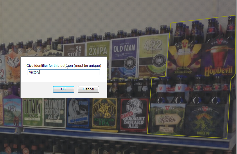
- DO NOT DRAW A POINT TO COMPLETE YOUR SHAPE! Either Right-Click or press the “Complete Polygon and Name” button at the bottom
- When you Complete a Polygon, give it a name. This should match up with a field from the other data you want to blend onto the polygons
- Draw all the polygons you want, following steps 2-4 above.
- Once you’ve drawn all the polygons, press the “Output Polygons” button. You’ll then see the correct Background Image settings for Tableau and a list of points in CSV format
- Copy the list of points (including the headers) over into a text file and save it as a .csv
- You can go back and add more after your initial output. Just press “Output Polygons” again and the output at the end will update.
- Use the “Background Image Settings in Tableau” area as correct values when you go to Maps->Background Images->Add Image in Tableau Desktop
The biggest thing to remember is that you DO NOT HAVE TO DRAW the last point, just RIGHT-CLICK or press “Complete Polygon and Name”. You can also reverse back any misstep up until you have completed the Polygon.
Change your color to something you can see against your image, then start clicking to draw.
 Now right click to finish, and give it a name. You’ll see the line drawn to complete it, but this is just a visual aid and not actually written into the data. Tableau completes the polygons automatically as well.
 Draw as many polygons as you need, and when you are done, click the “Output Polygons” button at the bottom of the page.
You’ll see a pop-up box with some instructions, the settings for the Background Image you’ll need in Tableau, and a text box with the CSV output of the polygons.
Copy the CSV from the text box and either save as a text .CSV or paste the data into Excel. If you paste into Excel, use the Text-to-Columns function to split by Comma. You can also use directly as a CSV, because we’re going to be using Data Blending.
Now we’ve got the essential components to make our planogram. Fire up Tableau Desktop, and connect to your initial data. Then make a second data source to the polygon data. Start a sheet using the Polygon data source.
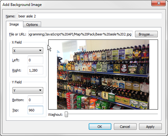
The first thing we need to do is set up the background image. This is is set in the Map->Background Images menu (choose the Polygon data source as it will be our primary data source)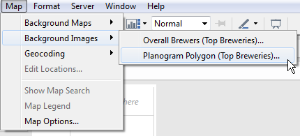
Now in the following menu, choose “Add Image”. Press “Browse” to find the background image file. This is where the middle section of the output from the tool becomes important.
This: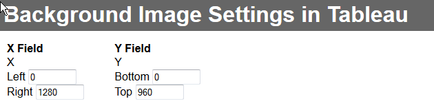 Tells us how to set up here:
We’re going to use those settings one more time in a little bit. Now let’s press OK until we’re back on our worksheet. The Columns shelf in Tableau is the X-axis, and the Rows shelf is the Y-axis, so we want to bring our X and Y Measures out accordingly. Let’s also change the aggregation to AVG() instead of SUM.
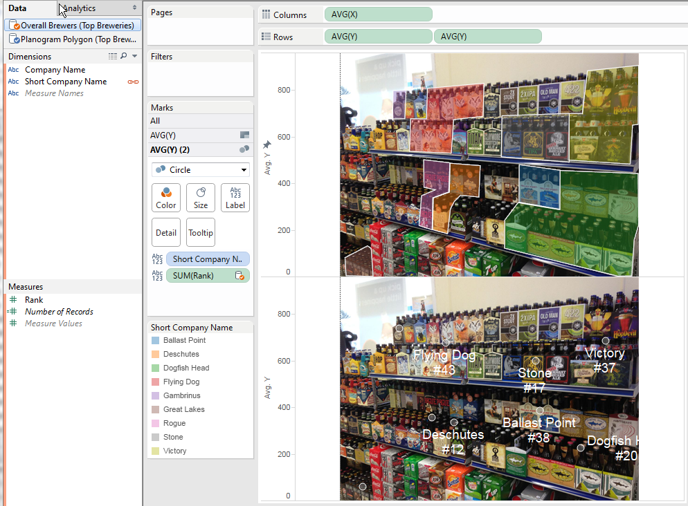
Now you should see your image, but it may be cut off. We need to fix the axes to match with the same settings are the background image. Right click the x-axis, choose “Edit Axis”, then set Range to Fixed — Start = 0 , End = “Right” from our settings. In this case it is 1280. Now do the same for the Y-axis: Fixed — Start = 0, End = “Top” from settings (960 here). Now you should be seeing your whole image. Last, right click on both the x- and y-axes and de-select “Show Header”. Now you just see the image.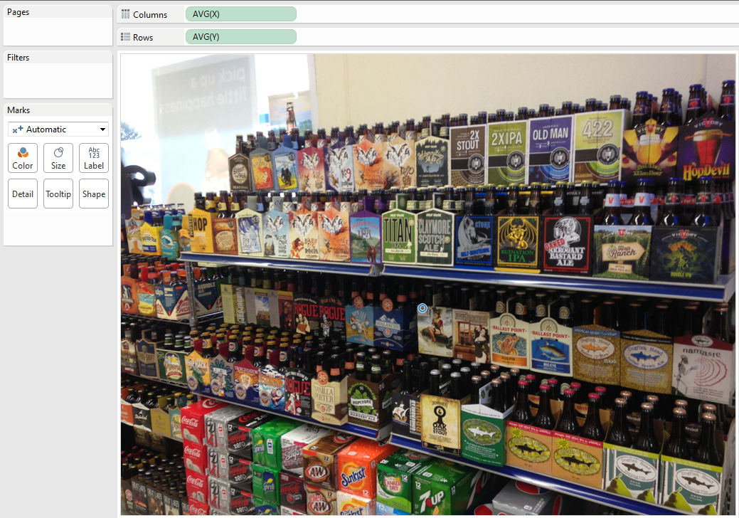 But we just have a single point in the middle! Where are our polygons we so lovingly drew? Tableau is rolling everything up into one single average point, because we haven’t split anything else out yet using the Marks card. Change the Marks card from “Automatic” to “Polygon”. Now I’m going to drag “Company Short Name” (my identifier) onto Color. It’s going to look ugly for a second, that’s okay. Drag “Path ID” onto “Path” and you should now see each polygon in a nice filled color.
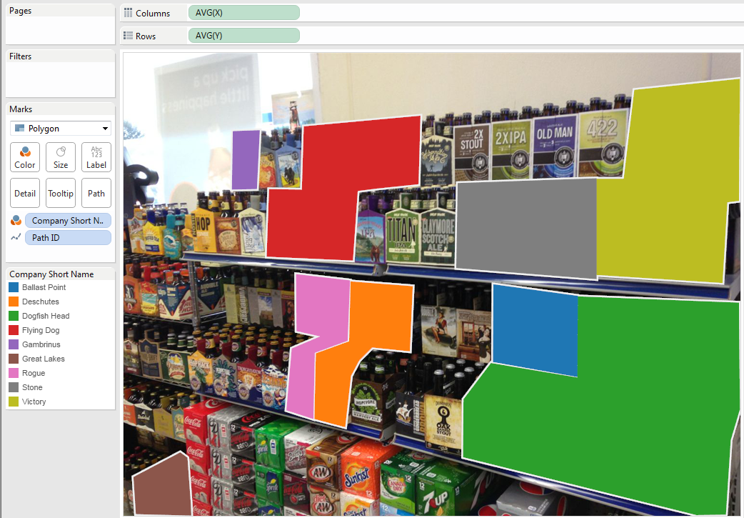 Now we can adjust our transparency and borders using the Color button on the Marks card. I find somewhere around 40% still distinguishes while letting the underlying show through. You may want the blocks colored solid, it’s all up to you.
How do we get the labels like in the original image? We’ll use a Dual-Axis map to create a second layer. Press Ctrl and then drag your AVG(Y) to the right to duplicate it. You should see two maps, one on top of the other. There are also now three marks cards. Choose the one on the bottom. Drag “Path ID” away to the left to throw it away, and change the Mark type from Polygon to Circle. Now we have circles for each polygon, right in the middle (this is why we changed our aggregation to AVG() ).
Here we use Data Blending to bring in our data and layer it onto our polygons. Right-click on the Identifier field in the primary data source and rename it to match whatever identifies your data in the secondary data source. In my data, I change “Identifier” to “Short Company Name”. Now click into your Secondary data source. Drag a Measure out onto Label on the last Marks card, the one set to “Circle”. I also moved Short Company Name onto Label, and did some formatting so the labels are white instead of black.
 The last step is to right-click on the right AVG(Y) pill and choose “Dual Axis”. Right click the right y-axis and choose “Synchronize Axis”. You may need to de-select “Show Headers” for each of the two y-axes.
Now for an extra trick: If there are any labels not showing, right-click on the circle, choose “Mark Label”->”Always Show”. The label will now appear, and you can move it to a good place simply by dragging it. You can actually drag any of the labels around to place them better. You can turn the transparency on the circles to 0% and turn off borders to make the labels float on their own.
And there are the basics of building a planogram, or any other polygon set on top of a background map.

This is simply awesome! Thanks!
LikeLike
I’d just like to thank you for these wonderful tricks and for the very clear explanation!
LikeLike
I am attempting to use this tool, however when I open the HTML file, there is no option for me to “choose file” and there is no page with instructions, just the code you’ve written is present.
Am I missing something essential in this process?
Any advice you might have would be greatly appreciated.
LikeLike
Hi Allison,
GitHub isn’t the most intuitive site in the world. The best way to go about things is to press the “Raw” button, which should show you just the code in plain text. Go to File->Save As or Ctrl-S and save the .html file on your computer. Then do File->Open or Ctrl-O to open that file locally.
LikeLike
Awesome tool and techniques . Thanks a ton!
LikeLike
Thank you so much. I was going from blog to blog for a few days with no luck. Your post just made it simple and easy to understand. I was able to use your method and tool to test out simple data on to my background image and it works. Also helped me understand how Identifiers, path ID, and ranges of X and Y all come together in a custom polygon shape. Thanks once again!!
LikeLike